


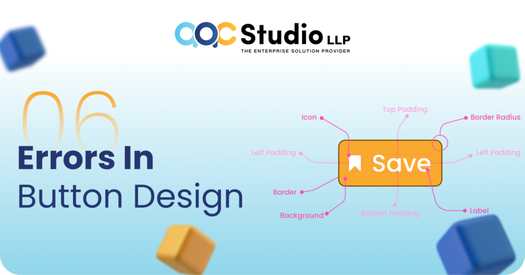
You have been designing a lot of buttons while making a websites. Some time it is a normal button design and sometime it is high-level using high-end css button design. But do you know there are some error in button design which you might ignore. So in this blog I will tell you about 6 types of errors which you should avoid while creating a button design.
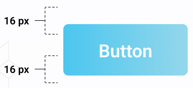
1. Make sure the button is neither too big nor too small.
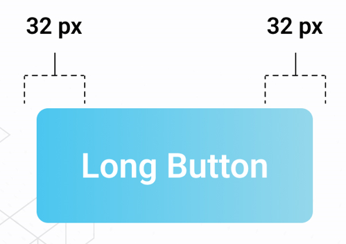
2. Make sure the button is neither too tall nor too short.
3. Alternatively, use this formula.
Lorem ipsum dolor sit amet, consectetur adipiscing elit. Ut elit tellus, luctus nec ullamcorper mattis, pulvinar dapibus leo.
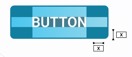
If the space between both the text and the border is “x,” the space between both the text and the border on the side can be “2x.”
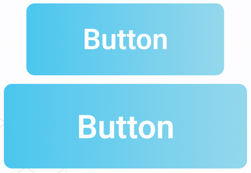
4. Make them as simple as possible.
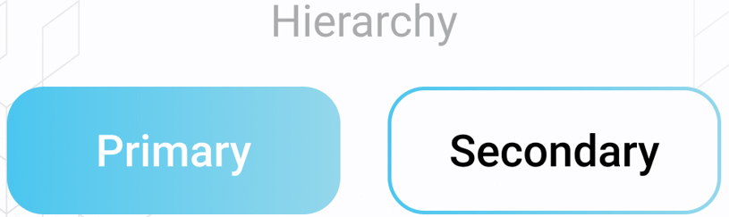
5. Don’t miss the hierarchy. You need hierarchy.
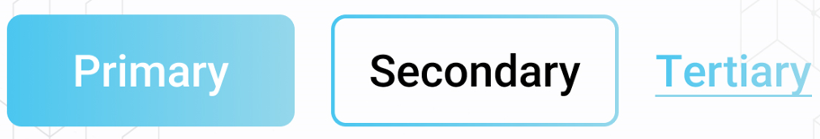
6. Not having 3 different types of buttons.
If you have like the post and if you want to share your views please share with us in the comment box!